Thamn: A Display Font That Commands Attention—Without Losing Clarity
I was finalizing the Instagram carousel for a client’s summer course launch—three slides deep, 8 a.m., coffee lukewarm—when I paused on Slide 2. The headline felt flat. Not wrong, just… forgettable. The sans serif we’d used for consistency across assets worked fine in body copy and captions, but here, in that top-third hero space? It vanished against the gradient background. That’s when I swapped in Thamn.
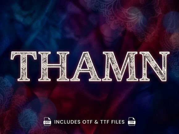
Instantly, the frame tightened. Not because it’s loud or chaotic—but because Thamn carries intention. It’s a display font, yes, but one with deliberate rhythm: subtle asymmetry in letterforms, confident stroke contrast, and a quiet sense of movement in its terminals. It doesn’t shout; it leans in. That’s rare—and useful—when you’re designing for fast-scrolling feeds where visual hierarchy has to land in under half a second.
Where Thamn Earns Its Place in Real Campaign Workflows
In practice, Thamn shines where impact matters more than volume: YouTube thumbnails (especially with bold, centered titles like “Your First Design Sprint”), Pinterest pins with short inspirational hooks (“Build With Intention”), Reels covers needing instant recognition (“New Course Drops Friday”), and email banner headers that must survive preview panes. I used it for a webinar series banner last month—“Designing With Purpose”—and watched how easily it anchored the layout without competing with the speaker photo or CTA button.
It’s not built for paragraphs. Don’t try to set a product description or feature list in Thamn. But as a campaign label, logo-style treatment, or hero title? It delivers personality *and* precision. The uppercase “T” has a graceful downward sweep; the lowercase “a” opens wide, inviting the eye. These aren’t gimmicks—they’re functional details that improve scanability on mobile, especially at 32–48px sizes.
Readability in Context: What Works (and What Doesn’t)
On light backgrounds? Crisp. On dark? Still legible—just avoid ultra-thin weight overlays unless you add subtle text shadow or stroke (I use 0.5px black at 30% opacity). For thumbnails and small previews, stick to Thamn’s medium or bold weight, all-caps, with generous letter-spacing (80–100 units in most design tools). That combo holds up even when compressed or viewed at 25% size.
Where it stumbles: tiny interface labels, dense comparison tables, or formal investor decks. Thamn isn’t meant for neutrality—it’s for moments where your brand wants to say something distinct. If your campaign voice is warm, thoughtful, and visually grounded—not corporate-polished or aggressively playful—Thamn fits like a well-tailored jacket.
Pairing It Right: Less Is More
I almost always pair Thamn with a clean, neutral sans serif—something like Inter, Manrope, or even system fonts like SF Pro Display. Why? Because Thamn brings texture; the sans brings trust. No need for flourishes elsewhere. In one Instagram template pack I built, Thamn handled all headline variants (“What’s Inside,” “Join the Waitlist,” “Limited Spots”), while Inter carried subheads, bullet points, and CTAs. The contrast created breathing room—and reinforced message hierarchy without extra design labor.
Avoid pairing it with other decorative fonts, scripts, or high-contrast serifs unless you’re doing intentional editorial design (e.g., a limited-run zine or art book cover). Even then, test spacing rigorously—Thamn’s character width and x-height demand attention to baseline alignment.
Practical Checks Before You Drop It Into Production
Before using Thamn in client work or digital ads, I scan three things:
- Licensing: Confirm commercial use is covered—especially for templates sold on marketplaces or ads running on Meta/Google. Some display fonts restrict redistribution or ad usage without extended licenses.
- File formats: Look for both .OTF and .WOFF2 if you’ll be using it on websites. Check whether variable font support is included—Thamn’s current release offers static weights, which keeps file sizes lean and load times predictable.
- Language coverage: It supports Latin-based languages (including accented characters for French, Spanish, Portuguese), but no Cyrillic or Asian scripts. Fine for most English-first campaigns, but double-check if your audience spans multilingual markets.
Also worth noting: Thamn includes stylistic alternates—like a swash “y” or connected “f-i” ligature—that add polish to custom wordmarks or short quotes. Use them sparingly. One per graphic is enough to feel intentional, not overdesigned.
When to Reach for Thamn—And When to Pause
Reach for Thamn when you need:
- A seasonal sale banner (“Summer Studio Sale”) that feels elevated but not sterile.
- An online shop campaign where product names are short and evocative (“Cove Lamp,” “Rill Chair”).
- A branded content series header—think “Studio Notes,” “Toolbox Tuesdays,” or “Foundations Fridays.”
- A landing page hero section where the first 5 words must communicate tone *and* topic before the visitor scrolls.
Pause before using it for:
- Long-form blog headers with complex clauses.
- Legal disclaimers, terms pages, or accessibility-critical interfaces.
- Brands whose identity relies on strict minimalism or technical authority (e.g., enterprise SaaS dashboards).
Thamn won’t fix weak messaging—but it will make strong messaging unforgettable. It’s not a trend font. It’s a campaign-ready display font with quiet confidence, built for creators who know that typeface choice isn’t decoration. It’s strategy—in shape, weight, and silence between letters.