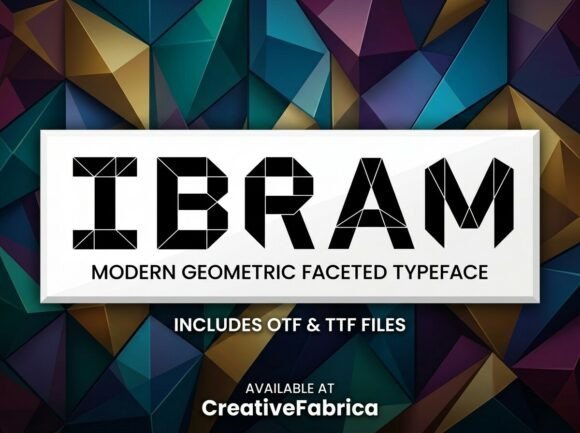
Ibram: A Bold Display Font That Commands Attention
Last week, I was refining the hero section of a boutique online store’s new product landing page—clean layout, soft photography, minimalist navigation—and something felt off. The headline lacked presence. Not just size or spacing, but *personality*. So I swapped in Ibram, and instantly, the page exhaled. It wasn’t louder—it was clearer. More intentional. That’s the quiet power of a well-chosen display font.
Ibram is a decorative display font built for impact—not decoration for decoration’s sake. Its letterforms carry subtle asymmetry, confident stroke contrast, and a grounded rhythm that avoids looking overly ornate or fragile. Think of it as confident rather than flashy: strong x-height, open counters, and carefully tuned spacing that holds up even at smaller display sizes (like 48px on mobile). It doesn’t shout; it invites focus. That makes it ideal for digital contexts where users scan in under two seconds—hero headlines, campaign banners, course title cards, or portfolio project names.
In practice, I used Ibram for three key elements on that landing page: the main headline (“Handcrafted Ceramics, Delivered Thoughtfully”), the subheading tagline (“Slow design, made for daily ritual”), and the primary CTA button (“Explore the Collection”). Each behaved differently—and that’s where understanding its role matters. As a display font, Ibram shines brightest when given breathing room: larger sizes, generous line height, and contrast-rich backgrounds. It performed beautifully over a light-textured image banner (with a subtle dark overlay for legibility), and equally well against solid charcoal and ivory backgrounds. But I quickly learned: don’t force it into body copy, navigation links, or tiny mobile buttons. Its charm lives in intentionality—not ubiquity.
Readability on mobile was surprisingly robust—especially when paired with a simple, highly legible sans serif for supporting text. I tested it at 36px on iOS Safari and Android Chrome: crisp, uncluttered, no hint of visual fatigue. The key? Limiting usage to one or two high-impact spots per viewport. On scroll, I swapped Ibram out entirely for the secondary headings—switching to Inter at 28px—so the eye could rest and re-engage without strain. That kind of hierarchy isn’t automatic; it’s designed. And Ibram makes that design decision feel effortless.
Where does it truly elevate a digital brand? Consider a coaching website launching a new signature workshop. Using Ibram for the workshop title—“The Clarity Loop”—immediately signals thought leadership and creative authority. Or a digital brand kit for an indie illustration studio: Ibram becomes the anchor in social media banners, email headers, and downloadable PDF guides. It works especially well alongside neutral, humanist sans serifs like Poppins, Lato, or even system fonts like SF Pro or Segoe UI. For editorial-leaning projects—a redesigned blog or newsletter—I’ve paired it with a warm, readable serif like Cormorant Garamond for subtitles, letting Ibram own the “hook” while the serif carries the narrative weight.
Before dropping Ibram into any live project, I always check four things: webfont availability (WOFF2 is non-negotiable for performance), included weights (Ibram ships with one strong regular weight—perfect for display use, but don’t expect light or bold variants), language support (it covers Latin-based languages well, including accented characters common in European branding), and licensing clarity. It’s a commercial font, so I verify usage rights for client sites, SaaS dashboards, and downloadable templates—no surprises later. Also worth noting: it includes stylistic alternates and ligatures, which add subtle polish to headlines when enabled via font-feature-settings in CSS—but only where they enhance, not distract.
One real moment that stuck with me: testing Ibram on a dark-mode variant of a course sales page. At first, the contrast felt too stark—almost aggressive—against deep navy. So I softened it with letter-spacing (+0.5px) and dropped the font weight slightly in perception by adjusting color brightness (using a near-white instead of pure #FFFFFF). Suddenly, it felt elevated, not harsh. That’s the nuance Ibram rewards: it doesn’t auto-optimize. It asks you to engage with it as a design partner—not just a typeface.
It’s not the right choice for every brand. A fintech dashboard? Probably not. A legal services site? Too expressive. But for creators, studios, makers, coaches, and small businesses building distinctive digital identities—Ibram delivers rare balance: artistic enough to stand out, structured enough to feel trustworthy. It adds warmth without sacrificing polish, distinction without alienating readability.
Pair it wisely. Use it sparingly. Give it space. Then watch how it changes the tone of an entire layout—not by overwhelming, but by clarifying what matters most.
- Best for: Hero titles, section headers, CTA buttons (larger sizes only), logo lockups, social media banners, course or product name displays
- Avoid for: Body text, form labels, navigation menus, small mobile buttons (<24px), long paragraphs, accessibility-critical interface text
- Pair with: Neutral sans serifs (Inter, Manrope, Montserrat) for UI and body copy; warm serifs (Cormorant, Playfair) for editorial depth
- Check before launch: WOFF2 delivery, fallback stack, contrast ratios (4.5:1 minimum against background), mobile viewport testing, license scope for your project type
Typography isn’t just about aesthetics—it’s about shaping how people feel before they even read a word. With Ibram, that feeling is focused, intentional, and quietly confident. And in today’s fast-scrolling, attention-scarce web, that’s not just nice to have. It’s essential.